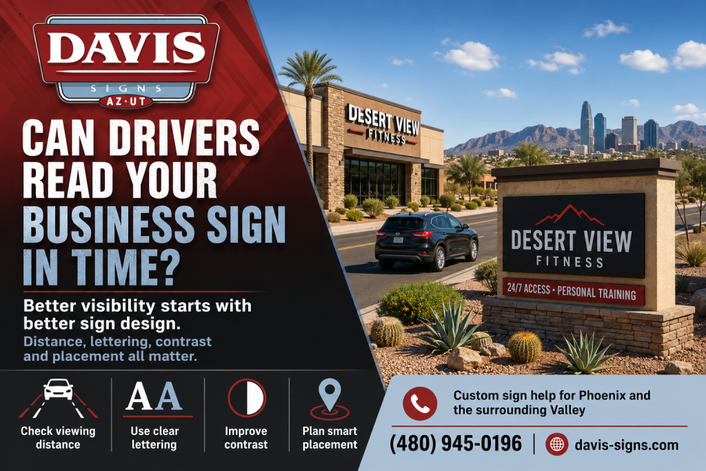
Can Drivers Read Your Business Sign in Time?
A business sign may look attractive from a few feet away and still fail from the road. That usually happens when the design is judged on a computer screen rather than from the position of an actual driver. In Phoenix, customers often approach businesses along broad roads, busy intersections and crowded shopping centres. They have only a few seconds to notice the sign, understand the message and decide where to turn.
That is why business sign visibility in Phoenix should be considered before fabrication begins, not after the sign has been mounted.
Start With the Real Viewing Distance
The first question is how far away the intended customer will be when the sign first becomes visible. A monument sign beside a driveway has a different job from channel letters mounted high on a building. A pylon sign near a major road may need to remain recognisable through traffic, landscaping and parked vehicles.
The Sign Research Foundation identifies viewing distance, sign size, placement and surrounding visual clutter as important parts of effective roadside sign design. A sign must also remain visible beyond common obstructions instead of appearing only when a driver is already passing the entrance.
Drive each approach to the property before approving a layout. Check the view from both traffic directions. A design that works for eastbound drivers may be hidden from westbound traffic by a tree, utility pole or neighbouring building.
Give the Main Message Room to Work
A roadside sign is not a brochure. Drivers should not have to search through a list of services, several telephone numbers and a long slogan to discover the business name. The most important information needs a clear visual order.
Usually that means placing the company name or logo first, followed by one short description when the name does not explain the business. Too much copy forces every line to become smaller and reduces the distance from which the sign can be understood.
Simple does not mean bland. Strong colour, a distinctive shape and dimensional lettering may carry a brand more effectively than filling every available inch with text.
Choose Lettering for Fast Recognition
Letter height matters, but letter shape and spacing matter as well. Narrow, decorative or tightly packed type may look sophisticated on stationery while becoming difficult to read from a moving vehicle. Research reviewed by the Sign Research Foundation shows that typeface choice, spacing, contrast and viewing angle all affect legibility.
Good commercial sign lettering has open shapes, clean spacing and enough contrast from the background. Test the design at a reduced scale that represents the expected viewing distance. When the wording begins to blend together, drivers will struggle with it too.
Check Contrast in Daylight and Darkness
A dark logo on a dark wall may disappear during the day. At night, glare may make fine lettering harder to distinguish rather than easier. An illuminated sign also competes with streetlights, windows, neighbouring signs and traffic signals.
Channel letters, monument signs and digital displays should be reviewed after sunset as well as during business hours. Lighting needs to be even and suitable for the site. The City of Phoenix regulates sign size, height, placement and permitting, so the final concept must satisfy local requirements as well as the company’s branding.
Do Not Forget the Final Turn
A visible building sign gets customers close to the property. Directional and entrance signs finish the job. In a large office complex, medical centre or shopping plaza, drivers may still miss the correct driveway or suite after seeing the main sign.
A complete plan may include roadside identification, building signage, parking directions and an interior directory. Each sign should use the same colours, names and visual cues so the route feels obvious.
Plan a Sign People Can Actually See
Davis Signs & Graphics designs, fabricates and installs custom commercial signs for businesses across Phoenix and the surrounding Valley. The team can review viewing distance, placement, lettering and illumination. Call (480) 945 0196 for a free commercial sign estimate and start planning signage that customers can notice, read and follow.
Live References
Sign Research Foundation: On Premise Signage, Legibility and Visibility
Sign Research Foundation: Illuminated Sign Conspicuity
City of Phoenix: Commercial Sign Information
Davis Signs & Graphics: Commercial Sign Services
Davis Signs & Graphics: Contact Information